Every web designer has the same embarrassing secret: the site they neglect most is their own. Ours had drifted into being a page-builder layout with the studio’s name on it and not much of a point of view. So we started again, properly — new palette, new type, new build. This is what we chose, and why.
Why we started again
The old site wasn’t broken. It was anonymous — the kind of design where you could swap the logo for an accountant’s and nobody would blink. For a studio whose entire pitch is that your website shouldn’t look like everyone else’s, that’s not a great look.
The deeper problem was structural. It was built in a page builder, which means every design decision lives inside a settings panel somewhere and none of it is written down. There was no palette so much as an accumulation — a colour picked in one module, a near-identical colour picked in another six months later, and no way to tell which was the real one. Rebranding was the excuse to define the thing properly and then put the definition in the code, where it can’t drift.
Colour: four constants and a set of cards
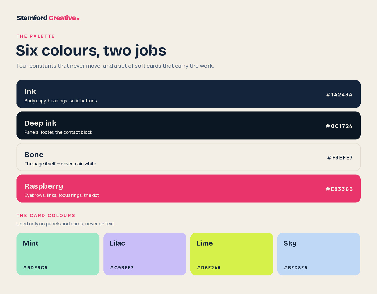
We split the palette into two layers, and the split is the whole idea.
The first layer is four constants that never change — not between pages, not between light and dark mode, not for a client’s favourite colour. The second layer is a small set of soft card colours that do the decorating. Text lives in layer one. Decoration lives in layer two. Nothing crosses over.
Bone, not white
Bone (#F3EFE7) is the page. It’s a warm off-white with a trace of yellow in it, and it’s the single decision that does most of the work. Pure white on a screen is a light source — it glares, it flattens everything on top of it, and it makes a site feel like a form you have to fill in. Bone reads like paper. It lets photographs sit on the page instead of floating above it, and it gives the ink something to be dark against rather than dark on.
It’s also quietly local. Stamford is a limestone town; everything from the Georgian frontages to the pavements is some version of warm off-white. We didn’t set out to make a literal reference and we’d never claim anyone notices. But it’s the right temperature for where we work, and that matters more than it sounds.
Ink, not black
Ink (#14243A) is a very dark navy doing the job most people give to black. Black on an off-white background is too hard a contrast — it buzzes at small sizes and reads as cheap at large ones. Ink has enough blue in it to feel deliberate and enough depth to hold a 96px headline without going grey.
Deep ink (#0C1724) is its darker sibling, and it only ever appears as a full panel — the footer, the contact block, the navigation bar. We use it to break the page into chapters. When you scroll past a deep ink band, you know a new part of the argument has started.
Raspberry, and where it’s allowed
Raspberry (#E8336B) is the only loud colour in the system, and it earns its place by being rationed. It appears on the eyebrow labels above headings, on the second line of a headline, on links, on the focus ring, and on one word in the logo. That’s the entire list.
We went to a pink rather than the obvious agency red or orange for two reasons. The first is that it’s a harder colour to use badly, which keeps us honest — a colour this bright forces you to be deliberate about where it goes. The second is simple differentiation: in a market of navy-and-orange and navy-and-teal, navy-and-raspberry gets remembered.
It has a limit, though, and it’s worth being straight about it. Raspberry on bone is a contrast ratio of 3.58:1. That’s fine for large display type and interface accents, and it is not fine for body text. So the rule in the system is that raspberry is allowed to be big or to be an accent, never to be a paragraph. Where a link or a button needs raspberry at reading size, it uses the deeper #C81F55, which clears 4.84:1 and passes AA. The bright one gets the headlines; the deep one does the reading.
The card colours
Mint, lilac, lime and sky exist for one job: filling a card or a panel that needs to be distinguishable from the one next to it. They’re deliberately pale, because every one of them has to hold ink-coloured text at a readable contrast — all four land between 9:1 and 12.4:1, which is comfortably AAA. A saturated card colour would have forced white text, white text would have forced a second text colour, and a second text colour is how palettes start to sprawl.
A palette isn’t a set of colours you like. It’s a set of decisions you’ve agreed not to revisit.
Type: two voices, clearly divided
Bricolage Grotesque for display
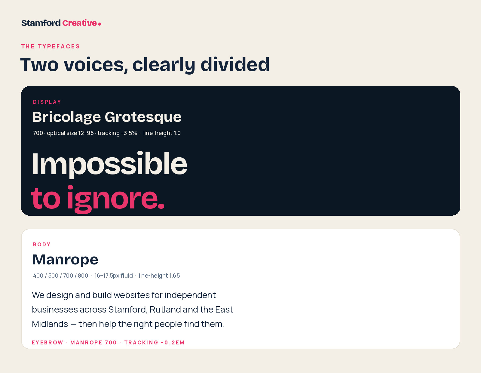
Bricolage Grotesque handles every heading, the logo, and the big statement lines. It’s a contemporary grotesque with just enough irregularity in it to have a personality — the terminals aren’t quite where you expect, and it has a slightly compressed, slightly impatient feel that suits short, blunt sentences.
The reason we chose it over the safer options is its optical size axis. It’s a variable font with an opsz range from 12 to 96, which means the letterforms physically redraw as they get bigger: tighter spacing and finer detail at display sizes, more open and sturdier when small. Most type pairings fake this with manual tracking. This one does it properly, and it’s the difference between a headline that looks set and one that looks typed.
We run it at 700 for headings with tracking pulled in to −3.5%, and a line-height of exactly 1.0. Headlines in this system are meant to stack like bricks — two or three tight lines with no air between them. The logo goes further, at 800 weight and −4.5% tracking.
Manrope for everything else
Manrope does the reading. It’s a semi-geometric sans with generous counters and unusually even rhythm, which is exactly what you want for body copy on a warm background. It doesn’t compete with the display face — same broad genre, completely different job — and it holds up at 14px in a form label as well as it does at 17px in a paragraph.
Body text is fluid between 16px and 17.5px depending on viewport, at a line-height of 1.65. That’s looser than most sites use, and it’s a deliberate concession to the background: warm off-white with dark navy text is high contrast, and high contrast text needs more room to breathe.
The one flourish is the eyebrow — the small raspberry label above most headings. Manrope at 700, around 12px, uppercase, with tracking opened right up to +0.2em. It does a specific job: it tells you what kind of section you’re about to read before you’ve read any of it, which lets the headline underneath be short and confident instead of explanatory.
The wordmark
The logo is not a logo. It’s the studio’s name set in the display face — “Stamford” in ink, “Creative” in raspberry — followed by a raspberry dot.
We went with a wordmark rather than a symbol because a symbol would have been a lie. A studio this size doesn’t need an abstract mark standing in for it; it needs its name to be legible at 20px in a browser tab. Setting it in the same typeface as the headings means the brand and the site are the same object, rather than a logo that has been placed on top of a design.
The dot is the one piece of pure personality. It’s a full stop — the studio’s name, said and finished. It’s also the smallest possible element that can carry the accent colour, which means the brand is present even in the header of a page that’s otherwise entirely ink and bone. It’s the sort of detail nobody consciously registers and everybody would notice if it disappeared.
One set of tokens, two modes
Every colour in the system is a CSS custom property, and they’re split into the two layers described above. The brand constants are fixed. The semantic tokens — background, surface, text, soft text, rules, buttons — are defined twice, once for light and once for dark, and the whole site switches by changing a single attribute on the <html> element.
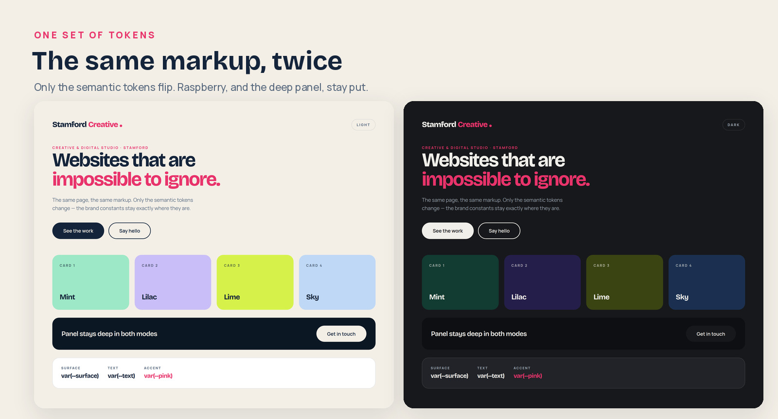
Dark mode isn’t an inverted copy. Bone becomes #17181B — a near-black with a hint of warmth, not a true black, for the same reason the light background isn’t pure white. The card colours get dark equivalents mixed from the same hues, so mint becomes a deep forest green and lilac becomes a deep indigo; the cards keep their identity and their order without anyone having to squint. Raspberry stays exactly where it is, at exactly the same value, because it’s the one thing that should look the same whichever mode you’re in.
| Token | Light | Dark |
|---|---|---|
| Background | #F3EFE7 | #17181B |
| Surface | #FFFFFF | #212328 |
| Text | #14243A | #F1EFEA |
| Soft text | #5A6B80 | #9AA4B0 |
| Panel | #0C1724 | #0E0F12 |
| Accent | #E8336B | #E8336B |
Why none of this lives in a page builder
The old site was built with a page builder. The new one is a custom classic WordPress theme, and the palette above exists as about thirty lines of CSS at the top of one stylesheet.
That’s not purism. It’s the only way a design system survives contact with a working website. In a page builder, “the accent colour” is a value typed into a colour picker in fourteen different places, and the fifteenth time somebody picks a slightly different pink and nobody notices for a year. In a theme, it’s one line. Change it once and the entire site follows — light mode, dark mode, buttons, focus rings, the dot in the logo.
It’s faster, too, which matters more for a site full of large images than any of the design above. But the real gain is that the brand and the build are now the same document. There’s no brand guidelines PDF that slowly stops describing the site. The stylesheet is the guidelines.
What we’d tell you to take from it
- Pick the background first. It’s 90% of the surface area and it sets the temperature for every other decision. Off-white beats white almost every time.
- Ration the loud colour. Write down the list of places it’s allowed to appear. If the list is longer than six things, it isn’t an accent any more.
- Check contrast before you fall in love. A colour that can’t carry text at 4.5:1 isn’t a text colour, however good it looks in the swatch.
- Two typefaces is plenty. One to shout, one to speak. Give them completely different jobs and never let them overlap.
- Put the decisions in the code. A palette that only exists in a PDF is a palette that’s already out of date.
If your own site has quietly become anonymous — and you’d know — that’s the kind of problem we like. Tell us about it.